The secret sauce that makes your branding stand out
If you’re feeling a bit bored with your current marketing materials, maybe it’s time to spice things up and give your brand some pizzazz!
Where do you start? How about unleashing the power of color psychology?
Color psychology might sound like a fancy-schmancy term. But trust me, it’s a real thing, and it can do wonders for your brand! By studying how different colors affect our moods, behaviors, and decision-making processes, we can use color to strategically boost our branding and marketing efforts.
But wait, there’s more! Color psychology can also add a whole new layer of depth and character to your brand. It’s like adding a splash of color to a black-and-white movie – it instantly makes everything more exciting and memorable!
Colors don't just catch the eye, they catch the heart too.
Color psychology can influence 85% of customers’ purchasing decisions. That’s why Pantone, known for its color matching and standard color systems, teamed up with Web3 VC studio sLabs to create color palettes for the metaverse. But keep in mind that color psychology has long had a place in traditional marketing.
Let’s play a game.
Imagine a brand. It could be any brand in the world. The first thing that comes to mind is the brand’s logo, right?
When you see the iconic golden arches of McDonald’s, you know you’re in for some fast food goodness. Or when you see the green and white mermaid of Starbucks, you instantly crave a cup of their signature coffee. These brands have mastered the art of using color to evoke emotions and create associations in our minds.
Colors increase brand awareness by 80%. Crazy, right?
So, if you’re ready to inject some personality and charisma into your brand, let’s dive into the world of color psychology!
Primary Colors
There are three primary colors: red, blue, and yellow. All other colors are combinations of these or lack thereof (black).
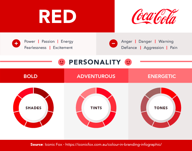
The psychological effect of the red color is associated with passion and aggression and evokes a sense of urgency. That’s why promotions and clearance sales often use this color. It also stimulates appetite, which makes it perfect for fast-food restaurants. Red increases people’s heart rate and blood pressure. That’s why it’s also associated with movement and excitement.
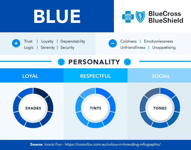
Blue is the world’s favorite color, with men preferring it more than women. And brands feel the same way. Blue is one of the most powerful colors for promoting reliability and tranquility. People associate blue with the sky and water. It creates a sense of peace and security. Companies choose blue among all other colors in marketing to promote trust in their products.
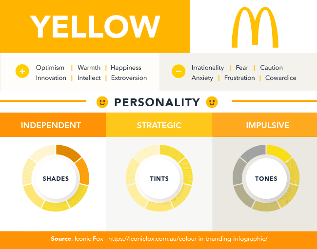
If you’re wondering what colors stand out the most, yellow is one of the answers. Yellow is associated with the sun and evokes positive emotions – happiness, creativity, and optimism. According to color psychology, it’s the most eye-catching color. That’s why it also symbolizes warning and creates anxiety. Companies use the latter to draw in impulsive buyers.
Secondary colors
The secondary colors are green, purple, and orange – the result of combining two primary colors.
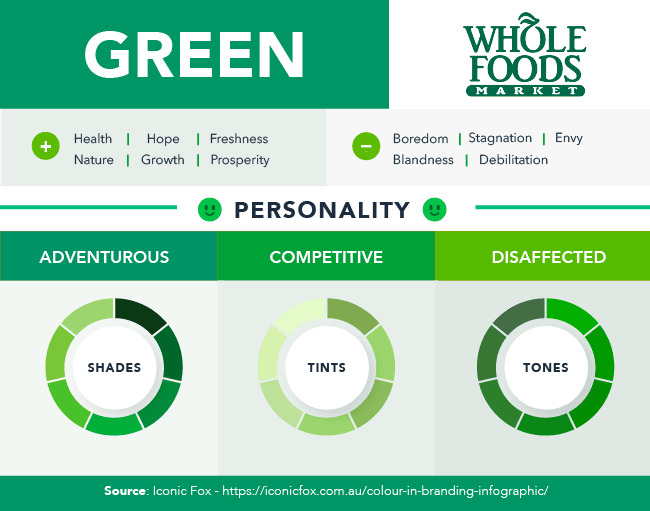
Without exaggeration, green represents life. Green is the color of nature. It’s associated with health, tranquility, and power. Companies often use green to relate to bio-production or to promote their eco-friendliness. This color evokes harmony and stability. But because of its primitive nature, the color can also represent boredom, stagnation, and blandness.
Purple is one of the rarest colors to appear in nature. That’s why it’s associated with uniqueness and is known as a royal color. It implies wisdom, sophistication and luxury, and it stimulates creativity. The cosmetics industry often uses purple to promote beauty and anti-aging products. Purple can also represent decadence, moodiness, and excess, so strike a balance when using this color.

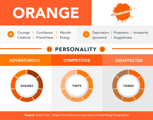
Orange is a combination of red and yellow. That’s why it mixes yellow’s energy and red’s power. This bright color conveys confidence, creativity, and courage. It’s one of the colors in marketing that stimulate impulsive buyers. In web design, orange is often the color of choice for designers when creating call-to-action buttons. The reason? Orange is associated with affordability.
Other essential colors
If your business is aiming for a clean vibe, white may be an ideal choice. Alongside black, white evokes a modern feel and can help achieve a pure, innocent, and pristine look. White is also the symbol of intelligence, professionalism, and cleanliness. On the other hand, white can feel sterile — like a hospital. Without colors, it might make your brand seem plain, boring, and empty.

Black is a double-edged sword when using color psychology for marketing. According to psychology, black represents power, tradition, elegance, and sophistication. Many luxury companies (say, Chanel) use black to make their logos look sleek and refined. Yet, in many cultures, black symbolizes oppression and coldness. People could even perceive black as symbolic of evil. Think Ursula the Sea Witch.

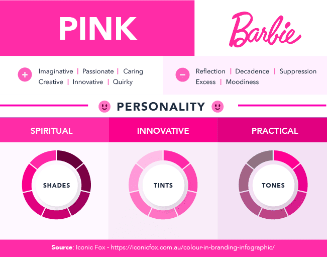
As the most popular color to evoke femininity, pink works with brands looking for a more imaginative and quirky feel. T-Mobile, for example, leans into its magenta coloring to help it stand out among competitors. For companies like Barbie, pink can be the perfect combination of femininity and youthfulness. The play doll giant’s pink logo helps market its products to a young audience.
General guidelines
Each color has its own influence on consumers. So choose colors that align with your brand’s personality and values. Think about what you want your brand to represent. Is it quirky and playful, or serious and trustworthy? Maybe it’s a little bit of both! Whatever your brand’s personality, choosing colors that complement it is key.
There are no strict rules about what colors you should use in different industries. However, specific colors are often associated with particular sectors.
Here are some general guidelines to help you get started:
- Art. Colors in the art industry can be as diverse as the artwork itself. Still, some popular ones are blue, green, and purple, by creating a sense of imagination and inspiration. But when you want to create a bold statement, red and black are sure to do the trick!
- Fashion. Black, white, and grey are perfect for creating a timeless and elegant look. But when you want to turn heads, bold colors like red and pink are in order!
- Music. Colors in the music industry can vary, but black is a classic choice for its timeless and sophisticated look. Bold colors like red and purple can create a sense of energy and excitement, while blue and green can bring a calming and relaxing vibe.
- Advertising. Blue is a popular choice for its trustworthiness and reliability. Red can create a sense of urgency and excitement, while green can bring a fresh and natural vibe.
- Architecture. Earthy tones like brown and green can create a sense of stability and connection to nature. Blue can bring a sense of professionalism and trustworthiness, while black can add a touch of modernity and sophistication.
- Healthcare. Blue is the color of choice in healthcare, giving off trust, professionalism, and cleanliness vibes. But don’t forget about white! It brings a sense of purity and sterility to the table.
- Technology. You’ll often find blue, green, and purple in this industry, radiating innovation and imagination. And, of course, black is always a classic choice, bringing a modern and sophisticated edge.
- Finance. Blue is a go-to color in finance, creating a sense of security, reliability, and trust. Green is also popular, symbolizing growth and financial stability.
- Food and Beverage. The food and beverage industry knows how to stimulate your appetite with colors like red, yellow, and orange. These colors create a sense of excitement and hunger. But don’t forget about green! It brings a fresh and healthy vibe to the table.
- Education. Blue and green are the colors of choice in education, creating a sense of knowledge, growth, and learning. Yellow is also a popular choice, symbolizing positivity and optimism.
- Real Estate. Blue is a popular color in the real estate industry as it conveys a sense of trust and professionalism. Earthy tones like brown and green may also be used to express a feeling of stability and growth.
- Beauty. Indulge in some self-care! Pastel colors like pink, peach, and lavender are the perfect choice in the beauty industry, creating a sense of femininity, softness, and relaxation. But don’t forget about red and black! They can add a touch of glamour and sophistication to any look.
- Sport. Play like a champion! Bold and vibrant colors like red, blue, and green are popular in the sports industry, creating a sense of energy, excitement, and strength. And when you need to show off your power, black is a perfect choice.
- Travel. Blue is a must-have in the travel industry, conveying a sense of trust and reliability. But don’t forget about green and brown! They can bring a sense of relaxation and natural beauty to your next adventure.
In a world of beige cubicles, a pop of color can make all the difference.
Choosing the perfect color isn’t just about what looks pretty or catchy; it’s also about understanding the cultural and societal associations that come with it.
Different cultures have their unique interpretations and perceptions of colors. For example, did you know that while white represents purity and cleanliness in the West, it is the color of mourning in many Eastern countries? Or that while red may represent passion and excitement in Western countries, it is considered a symbol of luck and good fortune in many Asian countries?
By getting to know your target audience and their cultural associations with different colors, you can avoid sending the wrong message or making a cultural faux pas.
And let’s not forget about the emotions and feelings you want to evoke with your brand. Do you want to communicate luxury and sophistication? Go for gold or silver! Trust and reliability? Blue is your hue! Energy and excitement? Get bold with bright colors like red or orange!
And the fun doesn’t stop there. You’ll also want to consider the context in which your brand will be used. Is it going to be online? You’ll want to choose web-safe colors that will display well on all kinds of devices. Is it going to be in print materials? You’ll want to choose colors that reproduce well in different printing processes.
Add your personality to this color game! Yes, it’s important to keep cultural associations and emotions in mind, but let’s avoid blending in with the boring bunch. You gotta be unique and stand out from the crowd!
So, here’s the deal – you want to choose a color that is not just any ordinary hue but one that is distinct and memorable! We’re not talking about the “basic beige” or “plain ol’ blue“. No, no, no! We want to find that sweet spot between fitting in and standing out.
So let’s sum it up, color connoisseurs. Choosing the right colors for your brand is all about being playful and professional at the same time. It’s all about creating a color scheme that shows off your creative side while still maintaining a level of sophistication.
And once you’ve got those colors locked in, be sure to use them consistently across all your branding and marketing materials. This will help establish a strong visual identity for your brand and make it easy for your target audience to spot you from a mile away!
Colorful ideas
And now that you have some essential tips for using color psychology in marketing and branding, here are some super fun ways to incorporate color that will make your brand stand out from the crowd:
- Get your shades on; it’s time for “Color of the Month”! Make things exciting by choosing a new color each month and getting creative with your content. Show off products in different shades of that color, share images of beautiful landscapes or quirky illustrations in that color, or even write a blog post about its hidden meanings. Let’s make your brand colorful and vibrant!
- Who says ads have to be boring? Use vibrant and bold colors to catch people’s attention in your advertising campaigns! Whether it’s a billboard that can be seen from space or an eye-catching video ad on social media, add a splash of color that reflects your brand’s personality. Get creative and show the world your brand’s true colors!
- Let’s make your packaging as exciting as the products inside! Say goodbye to dull brown boxes and hello to colorful packaging that will make your customers smile. Add some personality and flair to your brand by using packaging that reflects your brand’s unique style. Who knows, your customers might even keep the packaging as a fun keepsake!
- Want to make your call-to-action buttons stand out? Use bold and contrasting colors to make essential elements pop! For example, use a bright yellow button against a dark blue background to make it stand out and encourage clicks. It’s a surefire way to grab attention and get your message across!
Colors are the spices of branding. Color psychology is the recipe for success.
So are you ready to inject some color into your marketing and branding game? Let’s paint the town and the internet with some colorful ideas and make your brand stand out from the competition in a playful and professional way!
Happy coloring!
If you want to talk some more, we’re waiting for your DM on Instagram.
Your biggest fan,
Oana Corina Jelea.

OANA CORINA JELEA
The Big Cheese know-it-all
Find her on LinkedIn, Instagram and oanacorina.com


Add a Comment